Product Photography: Wild Chick Organics Skin Care
April 19, 2019
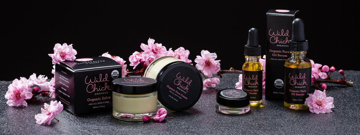
I recently finished a product photography assignment for Wild Chick Organics, a brand new skin care company in Portland, Oregon. Kate Egge, the founder of the company, is launching three products (an organic face cream, an organic salve, and an organic face oil serum). It was my job to make these new products look great for her website and marketing materials. In this blog post, I’m going to go through my process from start to finish so you get a sense how I approach a product photography assignment like this.
Q & A Time
What’s the story behind the product? Do you have any inspiration you’re working from? Do you prefer busy or minimal compositions? Before I’m able to envision the final images, I have to first get you talking about your project. I don’t assume to know how you want your (fill in the blank) photographed. After all, I want you to be thrilled by the final images, not shocked and confused (You can save those emotional responses for viewing my personal work.)
Anyways, Kate and I had been emailing back and forth for a while about her project, and once she was getting close to needing her products photographed, I suggested we meet in person and talk details. It takes about 299 emails to equate 25 minutes of chatting in person. It’s true, look it up. We talked about subjective things like concept, look/feel of the images, and inspiration. We also talked about logistical things like number of images needed, image resolution, time frame, and $$$. After a productive meeting, we had a plan in place. Fast forward a couple weeks, and it was time to break out the camera!
Product Photography = Patience
So, I have my marching orders from the client. I have everything I need for this job and all my gear is prepped. I suddenly realize it’s time to make it happen. Oh God!
Even when the pressure is on, product photography is pretty slow-paced. It’s a completely different approach and pace compared to portraiture, for example. There’s no, “That looks amazing, the camera loves you darling!” dialogue between the photographer and subject. The products are just staring at you. They have infinite patience. They’re actually kind of taunting you, or so it would seem. I mention this because if a client wants to attend a product photography shoot, they’re probably going to be kind of bored. Having a client on set is great for instant feedback, but texting an image proof works pretty well too.
I enjoy taking my time with product photography. I spent at least a couple hours just getting things dialed in for the first group of photos. I started this shoot by photographing the “banner” images for Kate’s website. Why start with these images? Some of them would incorporate fresh flowers, and I knew I had a limited amount of time before they would wilt and go to waste (more on this later). These first images were a very wide aspect ratio, which provided a fun composition challenge. Here is the finished banner photo of the organic face serum:
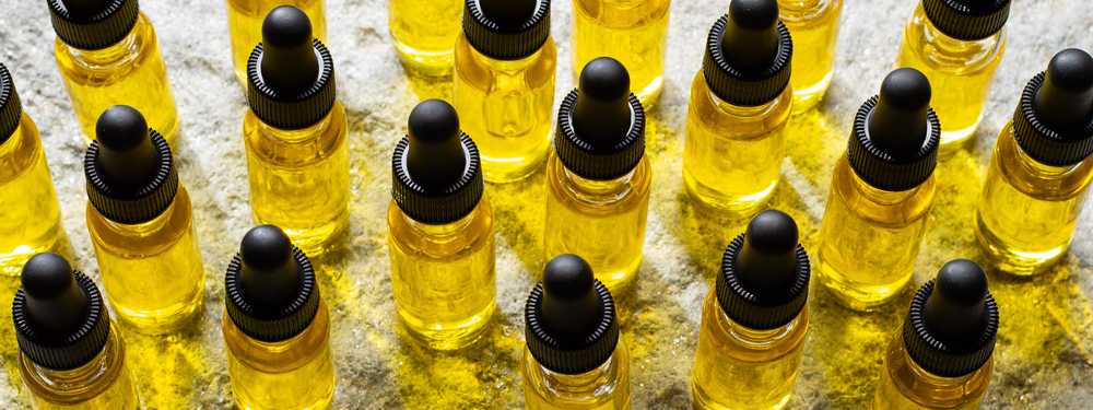
As you can see, using pattern was my way to create visual interest. I had to adjust the items many times before deciding on the one above. Place some bottles. Click. No, all these bottles are out of place. Move them around a bit. Click. Sill not feeling it. What about this? Click. There we go! Composition is one of those elements where I really just try to rely on feel and not worry too much about the “rules.”
Side note: I really like how the light going through the bottles creates a bright yellow cast on the surface!
Here’s another banner image for her website:
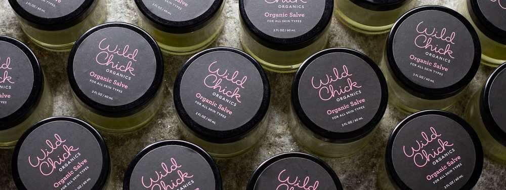
It’s the same basic composition idea, but this time with the Organic salve. This photo is all about the brand/logo on top of the lid. It’s also interesting to note that the feel of the photo has changed from the previous one. The light is no longer passing through the product, which causes a lot more shadows and makes the look a bit moodier. I like both in their own way.
Below is a look at one of my setups from the first day of shooting. I took the camera off the tripod to get this shot:
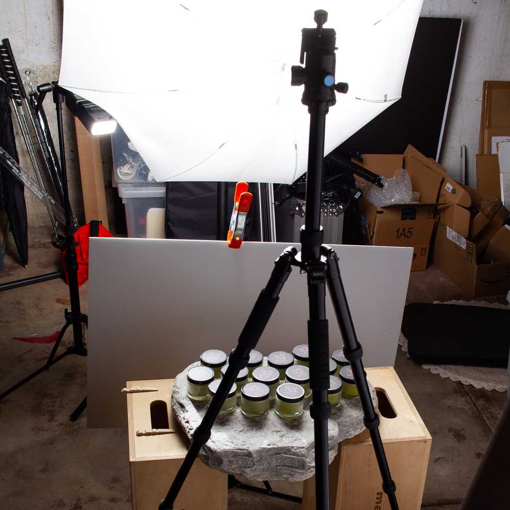
I love photography because it only matters what’s inside the frame. Nothing else exists, unless you show a behind the scenes photo. You can see the product is sitting on top of a thick slab of mica (the stone). Both the mica and the black slate (from the first photo) were really great to use as surfaces. They created a perfect canvas for these products during the environmental-looking product photos.
Fresh Flowers
I also created a couple fresh flower compositions for the Wild Chick website to accent all the actual product photos. This was a lot of fun and a different challenge from the earlier shots of the day. I knew the flowers had a very limited window of looking good, I didn’t want to have to buy more flowers when there were already a lot of great options to choose from.
Here’s the composition Kate liked best:
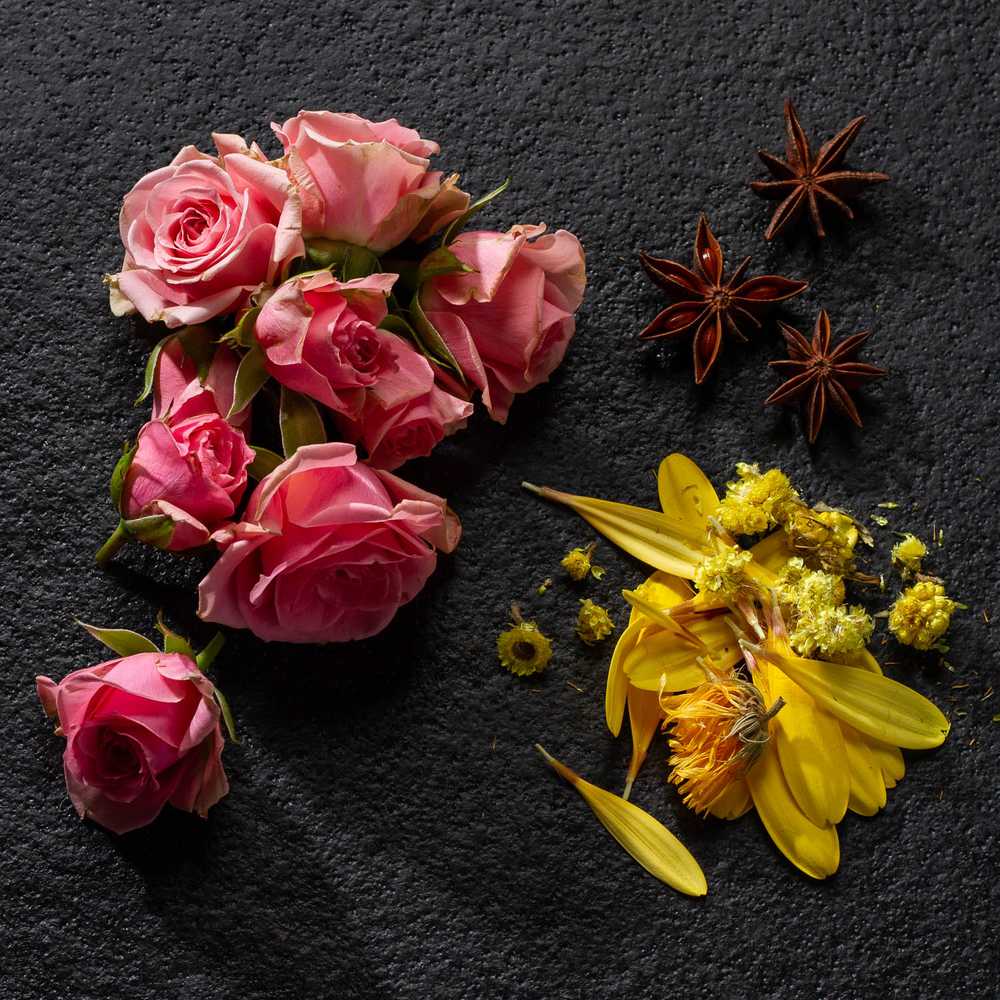
I’m really, really happy with this photo! I like all the textures and shadows on the slate surface from the lighting setup. It’s got some mood, doesn’t it?
The last photo that incorporated fresh flowers was the product group photo you saw at the beginning of this blog post. This was probably the most complicated photo of the entire assignment, and it was a great feeling when finally getting that one done.
Day Two: Product on White Seamless
I saved my white seamless photos for the second day of this assignment. There were about 15 photos I needed to take on white seamless, but my thought was once the lighting was dialed in, I would just set the products in place and it would move pretty quickly. Well, that was my thought at least. In reality, it took some time to get things looking the way they should. I photographed everything in very tight quarters, which can add to the struggle when trying to control lighting for white seamless. Also, there are many different looks/variables within the genre of white seamless catalog-looking photos that can affect the setup. For example, I usually like the look of a mirror-like reflection underneath the product. I tried this at first by placing the products on a piece of black acrylic. While the reflection was cool, it wasn’t stylistically vibing with the products (it also looked a little too artificial when paired with the photos from the first day). I texted a few proofs to Kate as I was dialing this look in, and she thought it would be better to minimize the reflection in the photos. I agreed and adjusted the setup accordingly.
When the client can’t be present at a shoot, I’ve learned it’s really beneficial to send work in progress proofs as I’m dialing things in, rather than sending a client photos that are essentially finished, but maybe not entirely what they were hoping for. I like to call it painting with broad strokes at first.
Here’s one of my favorite photos after the look was finalized:
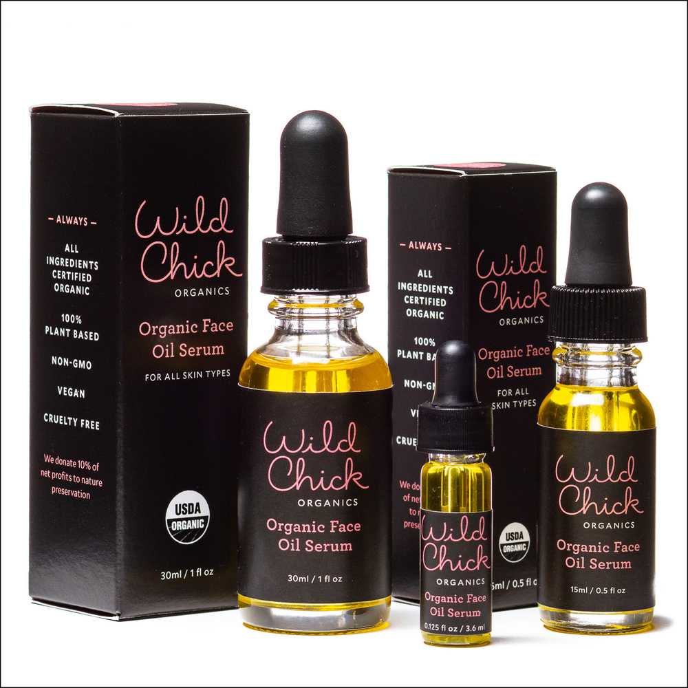
The smaller the product is, the more challenging placement is in a group composition. I felt like I was barely nudging the items around when adjusting composition, and they would be drastically different after each frame. I just had to keep doing very minor adjustments before I got things how I liked. It’s really just a game of patience.
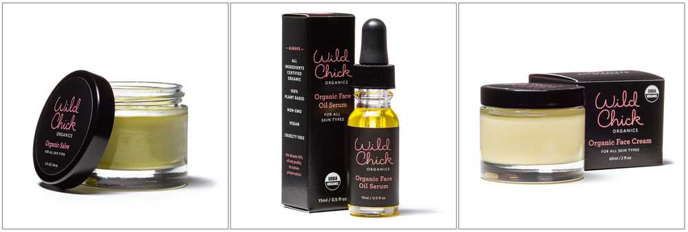
Here are a few more photos from the setup with minor lighting adjustments for each product:
And here is my setup from day two:
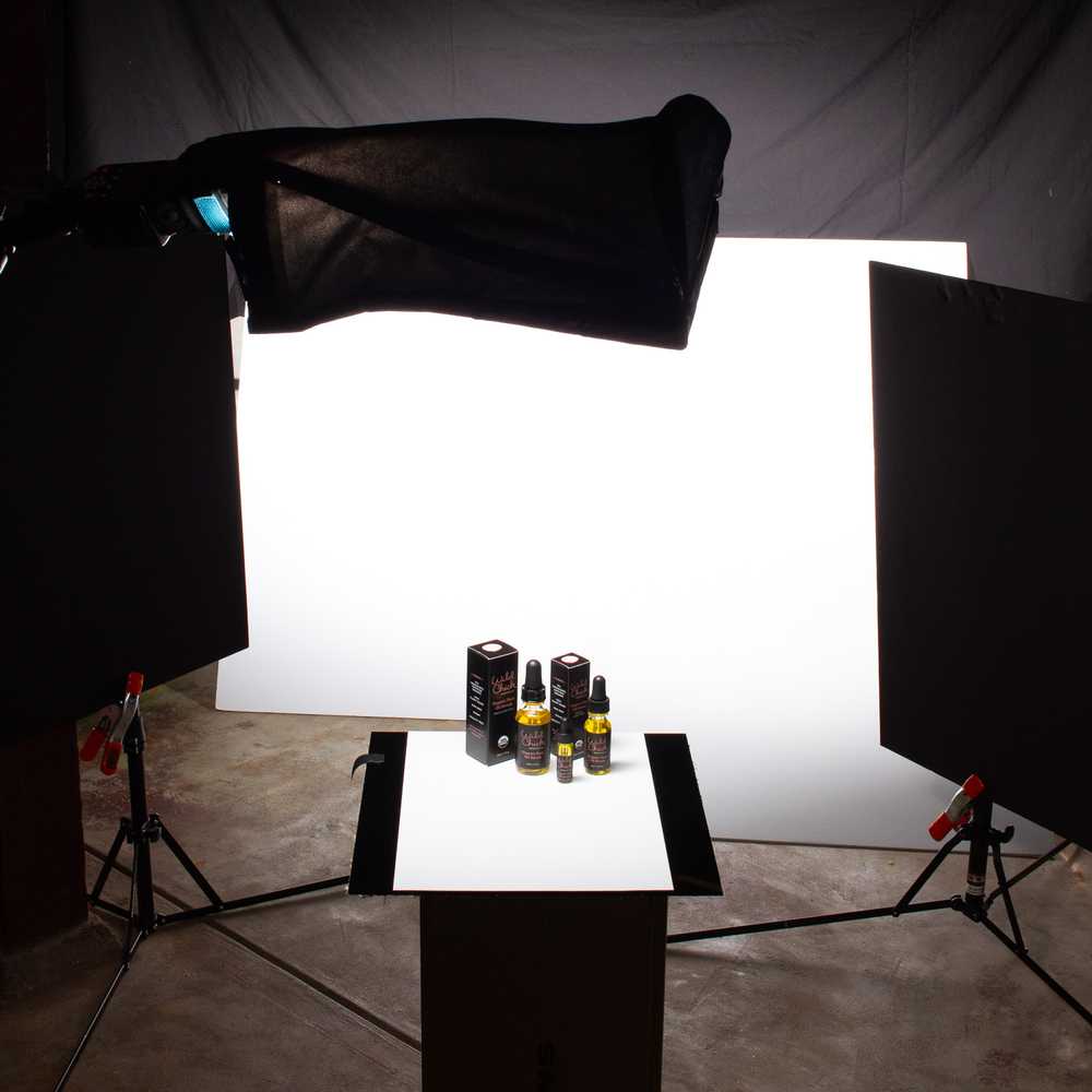
You can see the original black acrylic underneath a piece of art paper I used as the product surface (instead of a mirror-like reflection, a small shadow was created). Through the magic of lighting and a little post production, it turns to a clean white seamless look.
Wrapping It Up
I’m pretty excited how all these photos are going to look in the context of the Wild Chick Organics website and marketing materials. I wish Kate the best of luck in her new endeavor! After spending months or even years creating a product from scratch, I’m sure it would be very hard for a client to turn over that creation to a photographer and let him create the visuals. My hope is that by great communication from the very beginning, I’m delivering images that the client is thrilled to see. The word I’m looking for in an email after I send the proofs is “WOW!” not “HUH?”
I’m happy to say she used the former word and not the latter :)
-Chris
Go check out Wild Chick Organics and support a small Portland business with a great cause. Wild Chick Organics donates 10% of net profits to nature preservation.