The Sum Is Greater Than The Parts
September 19, 2021
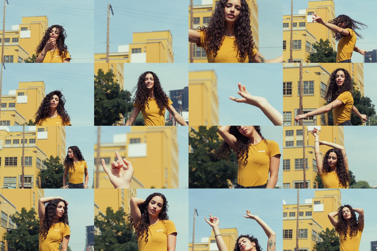
This summer I’ve been working on my portfolio a lot, trying to push my work in a new direction. I’ve been coming up with shoot themes that are specifically designed to get me out of my comfort-zone. It’s just too easy to just go with what you know! My intention with this portrait shoot was to have individual photos function as a part of a greater piece of work. In other words, to display multiple images as one image. I primarily used color as a way to unify groups of photos, but as you’ll see in the last example, I also tried a technique that somewhat resembles a darkroom contact sheet or maybe even a puzzle.
I collaborated with Annika, a model in Portland who I’ve worked with plenty of times in the past. Because we both know how each other works and what to expect, we can basically just hit the ground running during a shoot.
It’s also worth mentioning that we had to contend with the weather on this portrait shoot. You may not be able to tell by the photos, but it was hotter than shit that day, reaching about 104F. I also chose a purely concrete section of Portland as our location, which made it even worse! I just kept telling myself that soon enough, it will be 40F and raining with 3 hours of daylight, and that I should be very thankful for all this sunshine!
Speaking of sunshine, that’s what I relied on almost entirely for lighting during this shoot. There was just one location by an overpass that had poor light, so I added a bit of fill light to help things out.
Model Polaroids
When looking for inspiration for this shoot on Pinterest, I ran into some model Polaroids, aka digitals. This is traditionally a set of photos a model submits to a modeling agency to get signed. She is usually wearing very simple clothing, minimal if any makeup, and no retouching. However, what really drew me to this as a concept for my shoot was the idea of displaying a full-length, mid, and close-up view of the person side-by-side. By seeing all these at once, you get a better understanding.
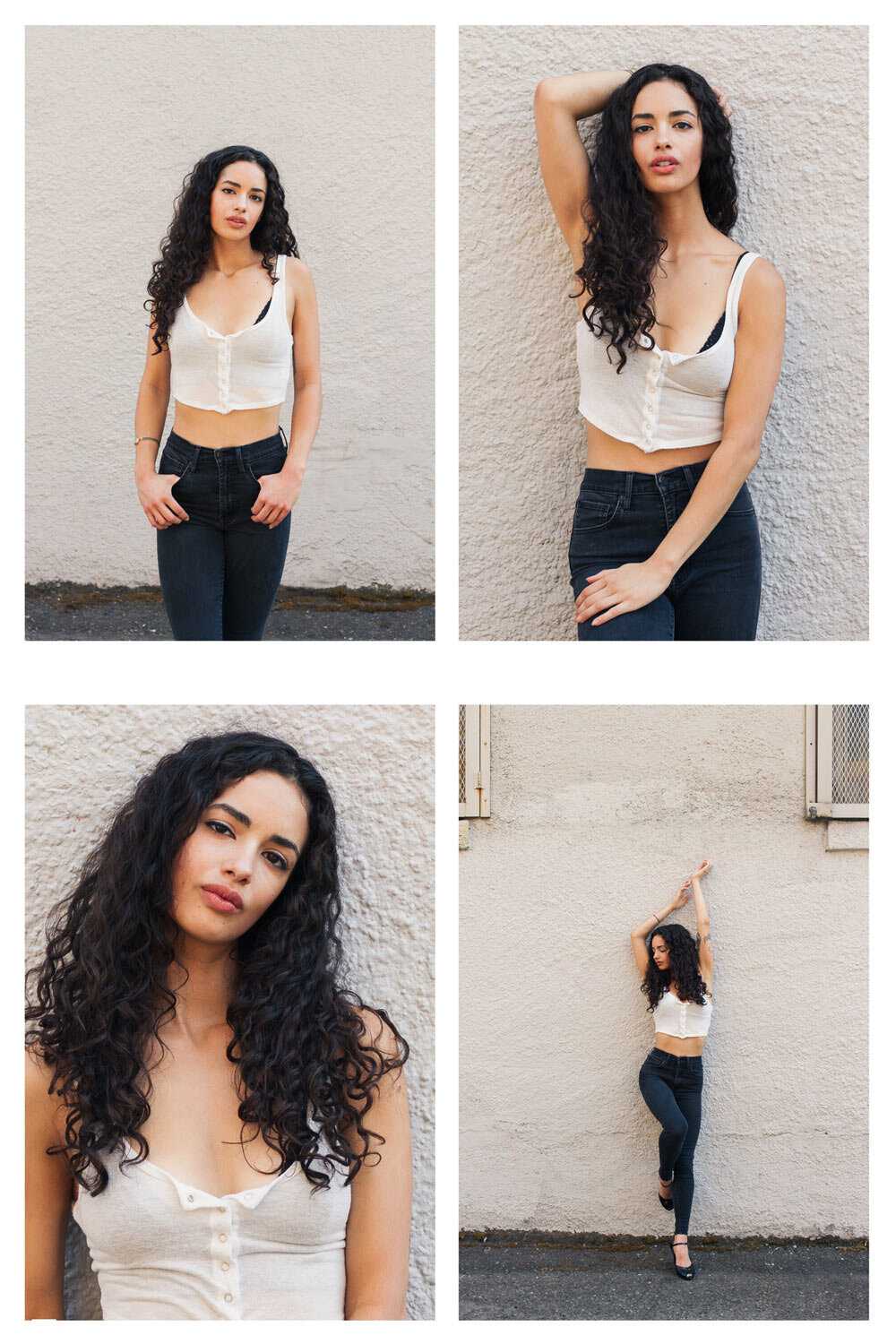
As you can see above, these photos are not considered textbook model Polaroids, but they give that look a nod. I also feel it’s worth noting that it’s getting progressively more difficult to find blank walls in Portland.
Blue Mural
I found a cool mural that seemed like a good background to pair with Annika's wardrobe. The only problem was the poor lighting, so I opted to use some fill flash. It ended up creating some really cool hard shadows on the wall behind her which add some interest to the geometric shapes. It was a fun spot to try out some interpretive posing based on the background.
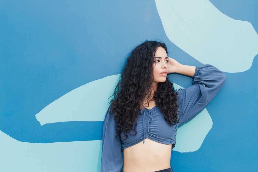
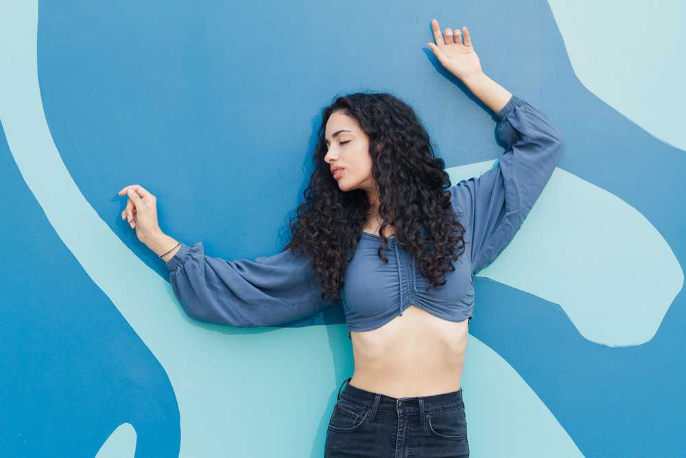
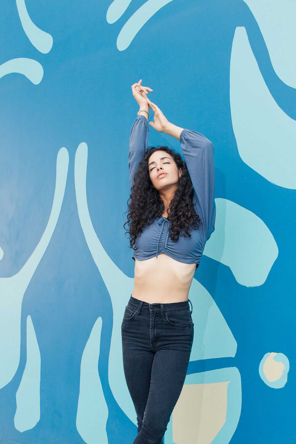
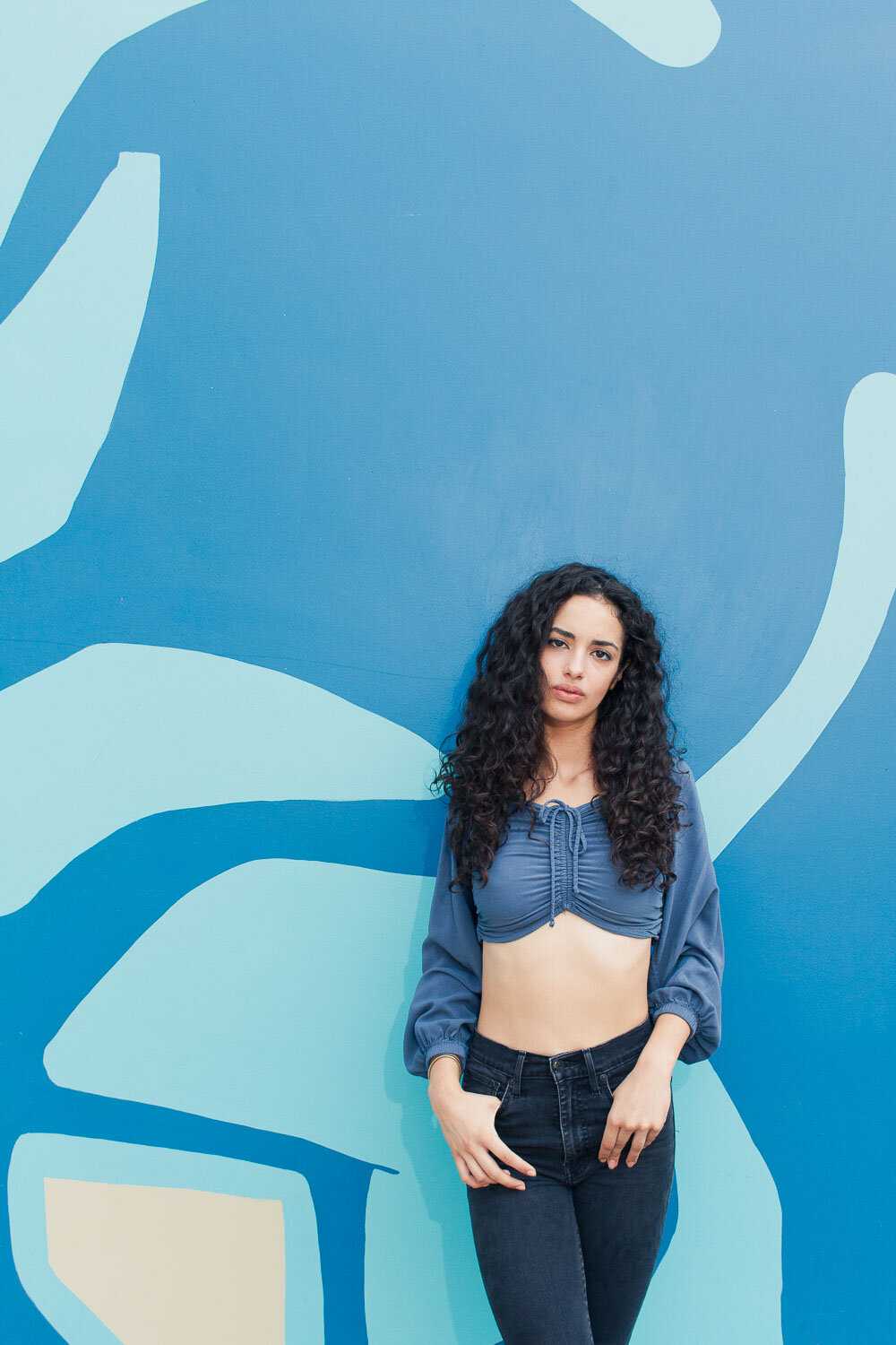
I'd say this look (above) functions less as a single piece of work than the other examples, but it still yielded some nice portraits!
3-2-1 Contact Sheet
I saved my most technical shot for the last part of our shoot. Here, I replicated a contact sheet look that I’ve seen photographers do before. Creating a contact sheet is traditionally a film/darkroom technique where you create a single print of an entire roll of film, and I’ve seen photographers use this idea as the medium itself to create a single image (where each frame was a portion of the scene). An analog contact sheet photo requires meticulous planning, which is why I chose to attempt this digitally, lol.
I described to Annika that I would be taking a ton of photos and slightly adjusting my position each time, and that she needed to just memorize and hold the pose for a number of minutes. I tried my best to make sure I didn’t miss a frame during this process, which meant counting rows and columns out loud.
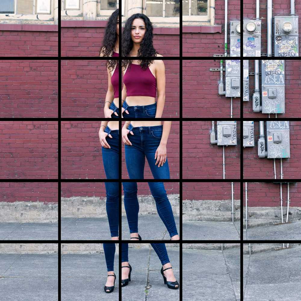
I spent a ton of time playing around with this layout in Photoshop after the shoot. You’d be surprised how challenging this was! I love how much this bugs my eyes out when looking at the entire piece.
Conclusion
I was really challenged by this shoot, both during the actual photography and also in post production for the contact sheet look. However, I'm not going to push my portfolio in a new direction if I don't get out of that comfort-zone behavior, right? Special thanks to Annika for doing a superb job on this shoot!
-Chris